Max Burgers
Max Burgers
Max Burgers

Logo Design:
Simple, Bold, and Memorable
Logo Design:
Simple, Bold, and Memorable
Logo Design:
Simple, Bold, and Memorable
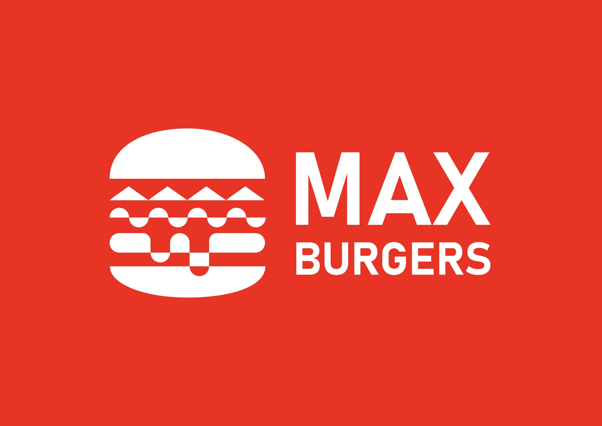
The Max Burgers logo combines simplicity with a strong visual impact, perfectly capturing the essence of the brand as a premium burger restaurant. The clean, bold typography paired with the minimalist burger icon ensures instant recognition. The white elements against a vibrant red background evoke appetizing energy, passion, and excitement, aligning with the high-quality and flavorful experience the restaurant offers. This color palette also creates a striking and modern aesthetic that appeals to a wide range of customers.
The Max Burgers logo combines simplicity with a strong visual impact, perfectly capturing the essence of the brand as a premium burger restaurant. The clean, bold typography paired with the minimalist burger icon ensures instant recognition. The white elements against a vibrant red background evoke appetizing energy, passion, and excitement, aligning with the high-quality and flavorful experience the restaurant offers. This color palette also creates a striking and modern aesthetic that appeals to a wide range of customers.
The Max Burgers logo combines simplicity with a strong visual impact, perfectly capturing the essence of the brand as a premium burger restaurant. The clean, bold typography paired with the minimalist burger icon ensures instant recognition. The white elements against a vibrant red background evoke appetizing energy, passion, and excitement, aligning with the high-quality and flavorful experience the restaurant offers. This color palette also creates a striking and modern aesthetic that appeals to a wide range of customers.

Packaging Design:
Elevating the Takeaway Experience
Packaging Design:
Elevating the Takeaway
Experience
Packaging Design:
Elevating the Takeaway Experience
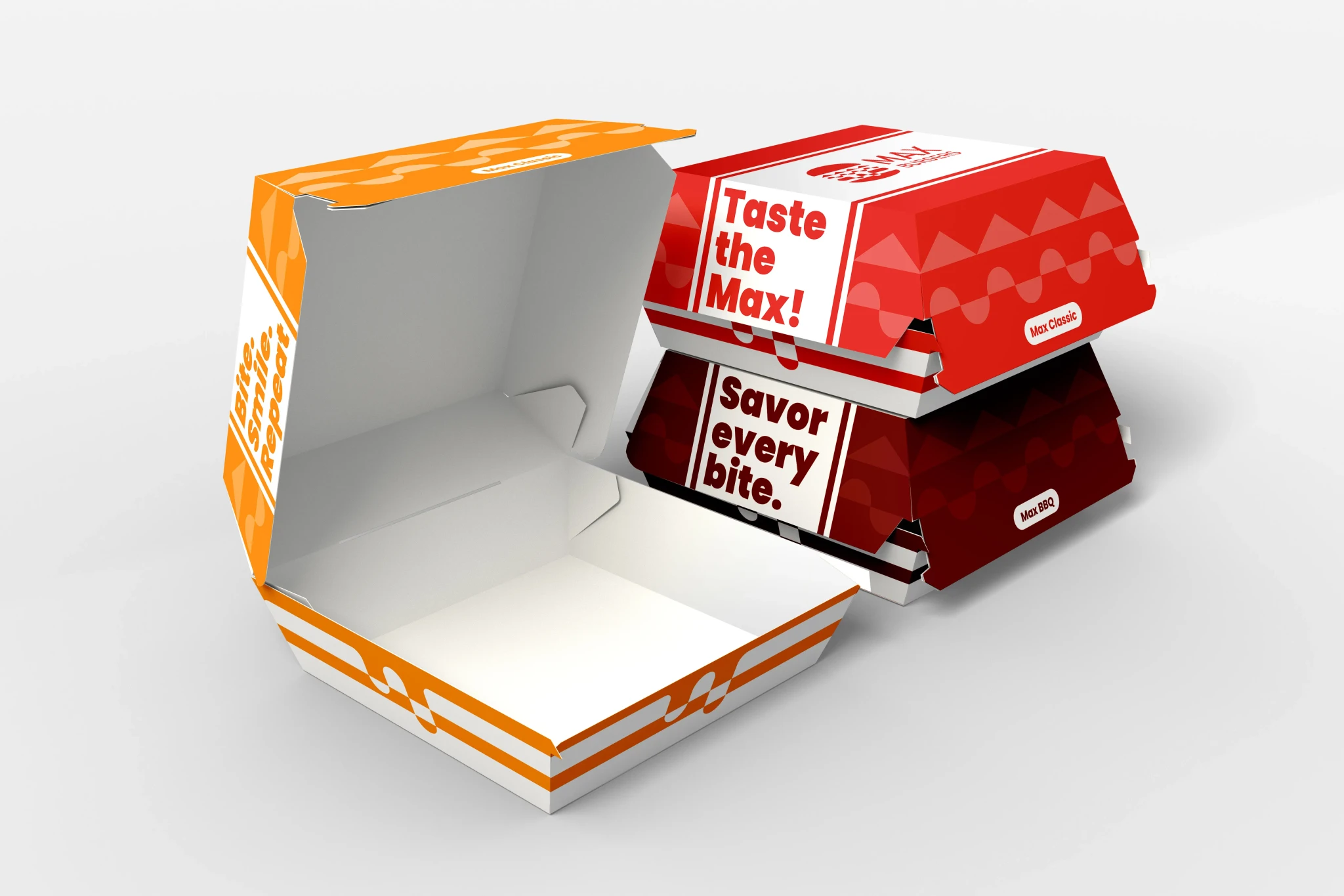
This packaging design for Max Burgers highlights the brand's modern and bold identity, with a visually striking red-and-white color scheme.
The use of clean geometric patterns ensures the packaging stands out while reinforcing brand recognition. Phrases such as "Taste the Max!" and "Savor every bite." create an engaging, playful tone, enhancing the customer's anticipation of the meal.
Combining practicality with aesthetics, the design ensures functionality while leaving a lasting impression, making it a standout choice for takeout or delivery in a competitive market.

Billboard Advertising:
Reaching Customers on a Larger Scale
Billboard Advertising:
Reaching Customers on a Larger
Scale
Billboard Advertising:
Reaching Customers on a Larger Scale
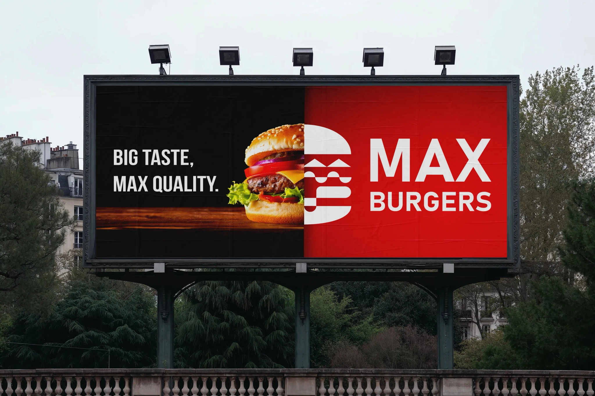
The Max Burgers brand extends its presence through a large-format billboard design, showcasing the restaurant’s core values: “Big Taste, Max Quality.” The layout is designed to grab attention with a mouth-watering image of their signature burger, perfectly staged to entice viewers. This marketing approach not only reinforces the brand’s identity but also creates a compelling call to action for hungry passersby. The bold use of red and white ensures visibility and memorability in high-traffic urban environments.
The Max Burgers brand extends its presence through a large-format billboard design, showcasing the restaurant’s core values: “Big Taste, Max Quality.” The layout is designed to grab attention with a mouth-watering image of their signature burger, perfectly staged to entice viewers. This marketing approach not only reinforces the brand’s identity but also creates a compelling call to action for hungry passersby. The bold use of red and white ensures visibility and memorability in high-traffic urban environments.
The Max Burgers brand extends its presence through a large-format billboard design, showcasing the restaurant’s core values: “Big Taste, Max Quality.” The layout is designed to grab attention with a mouth-watering image of their signature burger, perfectly staged to entice viewers. This marketing approach not only reinforces the brand’s identity but also creates a compelling call to action for hungry passersby. The bold use of red and white ensures visibility and memorability in high-traffic urban environments.
Let's get to know each other.
Let's get to know each other.
Let's get to know each other.