Bolt Energy Drink
Bolt Energy Drink
Bolt Energy Drink

Logo Design:
Logo Design:
Logo Design:
The BOLT Energy Drink logo combines modern minimalism with a dynamic visual aesthetic. The bold, geometric typography reflects strength and energy, while the subtle integration of a lightning bolt within the lettering symbolizes speed and vitality. The clean, sans-serif font conveys a sense of trustworthiness and professionalism, while the angular shapes in the background add a dynamic, forward-moving feel, emphasizing the brand's energetic identity.
The BOLT Energy Drink logo combines modern minimalism with a dynamic visual aesthetic. The bold, geometric typography reflects strength and energy, while the subtle integration of a lightning bolt within the lettering symbolizes speed and vitality. The clean, sans-serif font conveys a sense of trustworthiness and professionalism, while the angular shapes in the background add a dynamic, forward-moving feel, emphasizing the brand's energetic identity.
The BOLT Energy Drink logo combines modern minimalism with a dynamic visual aesthetic. The bold, geometric typography reflects strength and energy, while the subtle integration of a lightning bolt within the lettering symbolizes speed and vitality. The clean, sans-serif font conveys a sense of trustworthiness and professionalism, while the angular shapes in the background add a dynamic, forward-moving feel, emphasizing the brand's energetic identity.

Organic Energy Drink Branding
Mint Flavor
Organic Energy Drink Branding
Mint Flavor
Organic Energy
Drink Branding
Mint Flavor
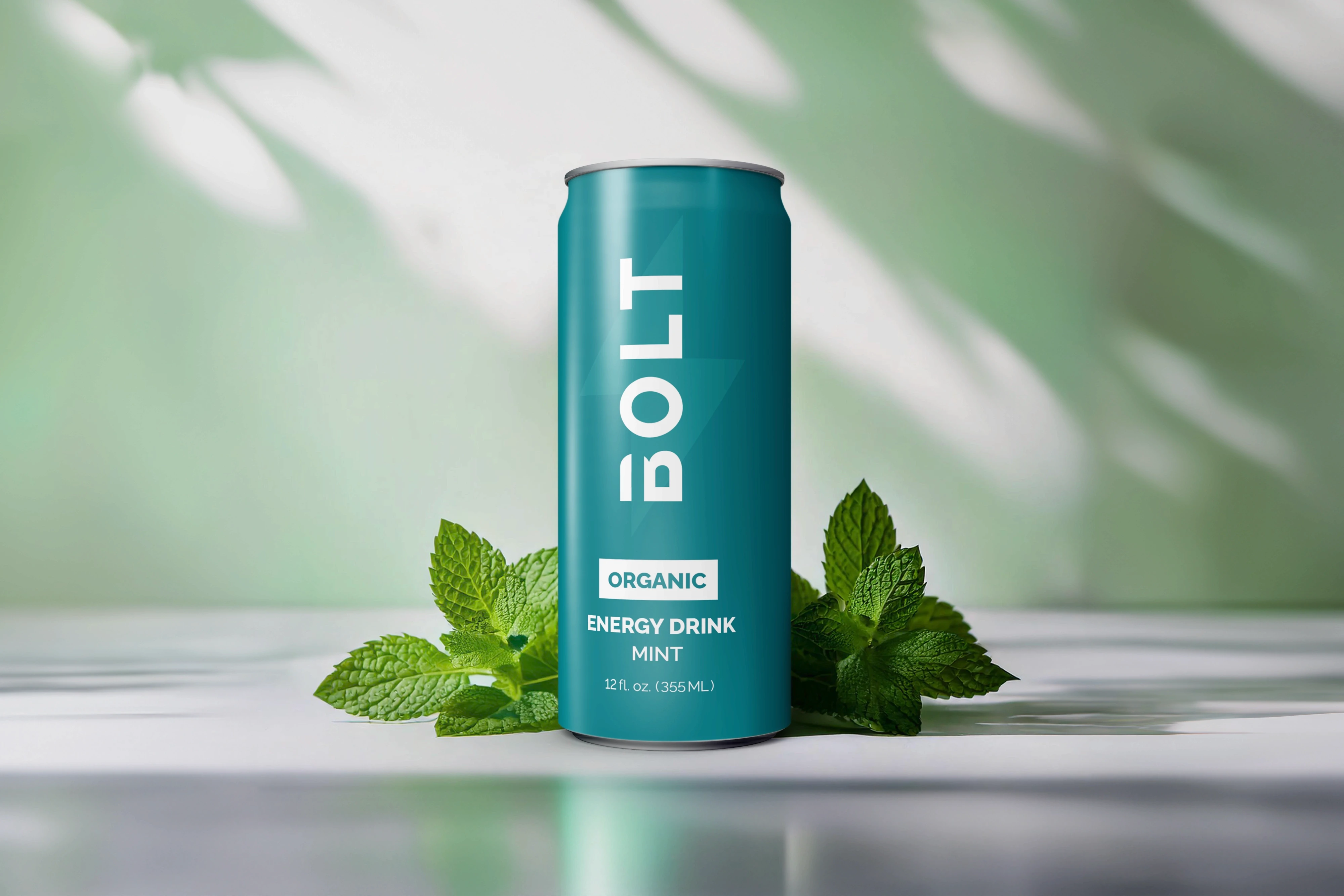
This energy drink packaging design captures the essence of freshness and purity. The minimalist color palette in blue-green tones reflects the natural qualities of mint, reinforcing the organic origins of the product. The composition incorporates balanced lighting and subtle details, such as fresh mint leaves in the foreground, to enhance the visual narrative. It strikes the perfect balance between elegance and functional branding.
This energy drink packaging design captures the essence of freshness and purity. The minimalist color palette in blue-green tones reflects the natural qualities of mint, reinforcing the organic origins of the product. The composition incorporates balanced lighting and subtle details, such as fresh mint leaves in the foreground, to enhance the visual narrative. It strikes the perfect balance between elegance and functional branding.
This energy drink packaging design captures the essence of freshness and purity. The minimalist color palette in blue-green tones reflects the natural qualities of mint, reinforcing the organic origins of the product. The composition incorporates balanced lighting and subtle details, such as fresh mint leaves in the foreground, to enhance the visual narrative. It strikes the perfect balance between elegance and functional branding.

Organic Energy Drink Branding
Cherry Flavor
Organic Energy Drink Branding
Cherry Flavor
Organic Energy
Drink Branding
Mint Flavor
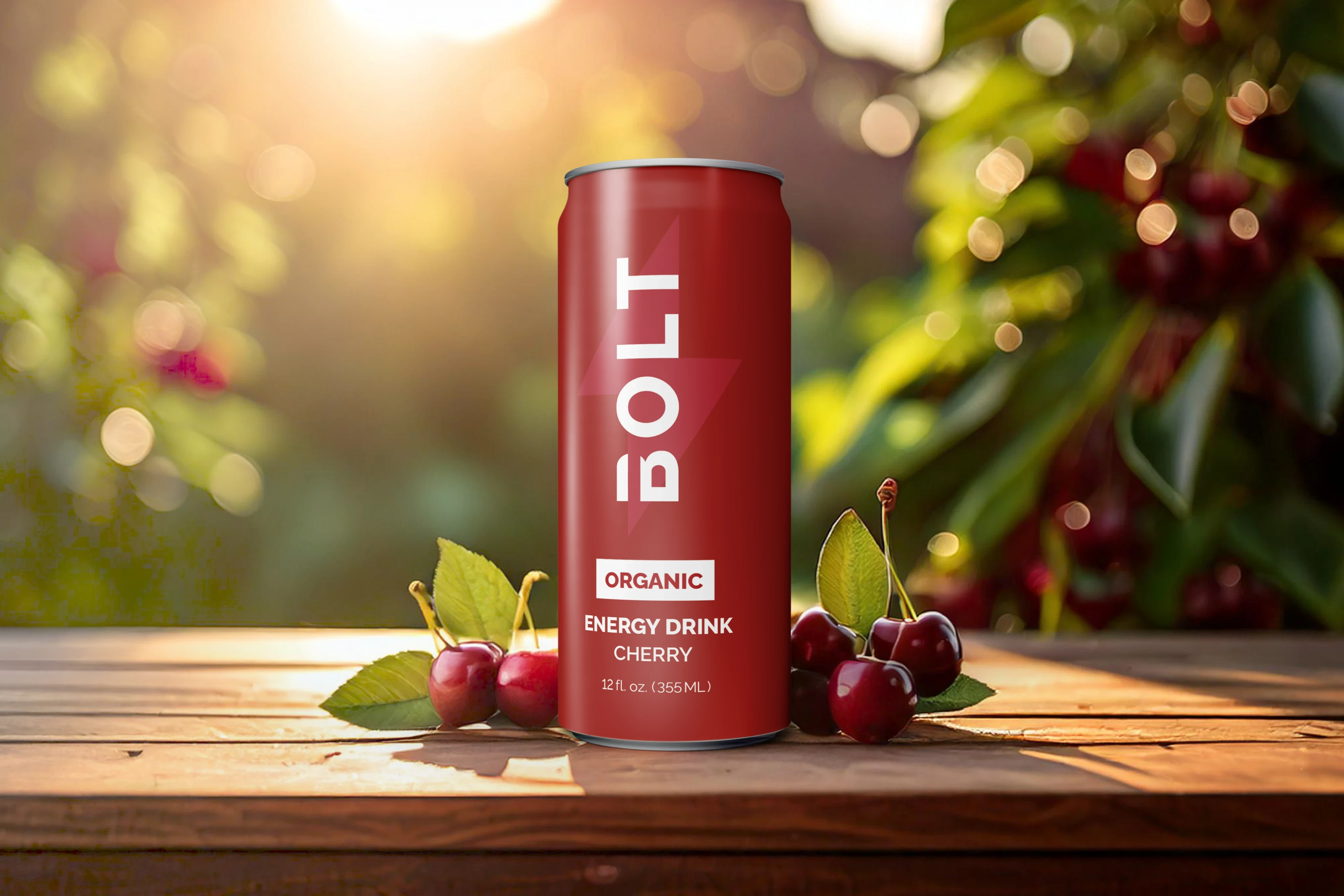
The packaging design for the cherry-flavored energy drink combines deep, vibrant reds with a natural setting that reinforces the product’s organic roots. The warm lighting and composition featuring juicy cherries create an authentic story of flavor. The design stands out for its simplicity and cohesion, reflecting the modern and eco-friendly image of the brand.
The packaging design for the cherry-flavored energy drink combines deep, vibrant reds with a natural setting that reinforces the product’s organic roots. The warm lighting and composition featuring juicy cherries create an authentic story of flavor. The design stands out for its simplicity and cohesion, reflecting the modern and eco-friendly image of the brand.
The packaging design for the cherry-flavored energy drink combines deep, vibrant reds with a natural setting that reinforces the product’s organic roots. The warm lighting and composition featuring juicy cherries create an authentic story of flavor. The design stands out for its simplicity and cohesion, reflecting the modern and eco-friendly image of the brand.


Organic Energy Drink Branding
Pineapple Flavor
Organic Energy Drink Branding
Pineapple Flavor
Organic Energy
Drink Branding
Mint Flavor
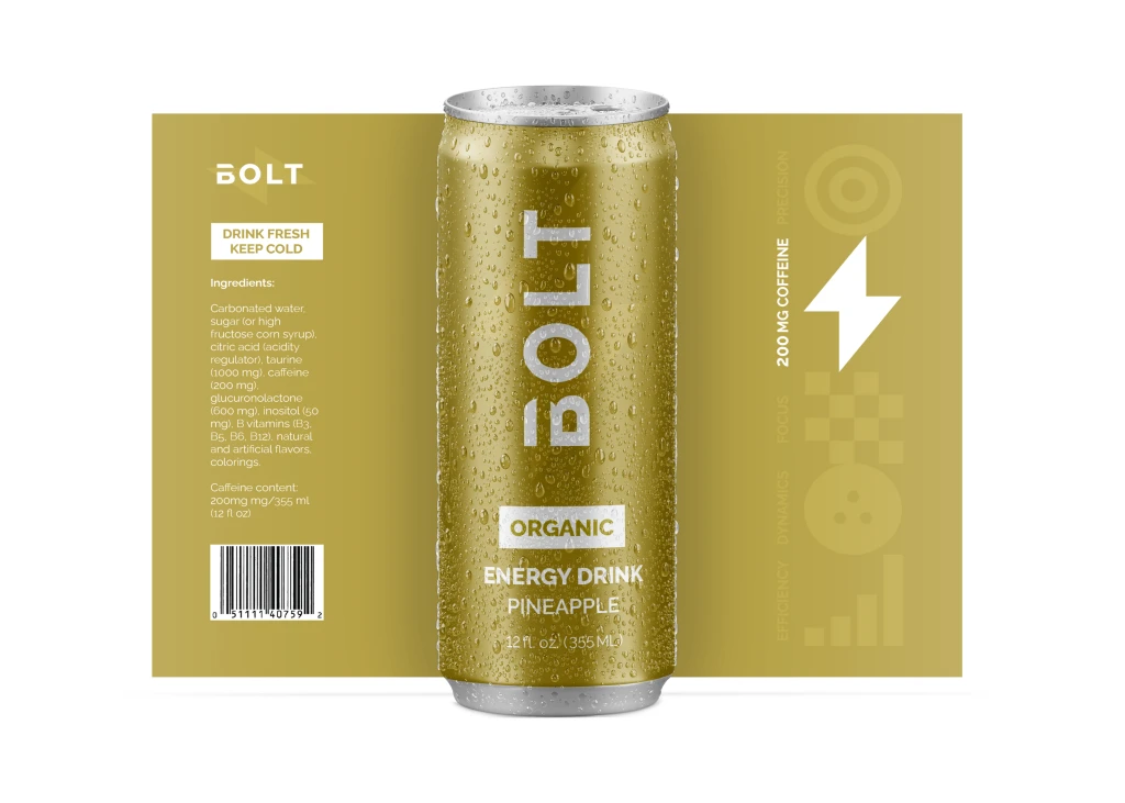
This packaging design highlights the natural flavor and organic nature of the energy drink. The warm golden tones of the can reflect the freshness of pineapple, the central visual element of the composition. Carefully chosen lighting and a natural background add dynamism and energy to the overall look. The design combines minimalism with bold branding, making it eye-catching while emphasizing the brand’s eco-conscious values.
This packaging design highlights the natural flavor and organic nature of the energy drink. The warm golden tones of the can reflect the freshness of pineapple, the central visual element of the composition. Carefully chosen lighting and a natural background add dynamism and energy to the overall look. The design combines minimalism with bold branding, making it eye-catching while emphasizing the brand’s eco-conscious values.
This packaging design highlights the natural flavor and organic nature of the energy drink. The warm golden tones of the can reflect the freshness of pineapple, the central visual element of the composition. Carefully chosen lighting and a natural background add dynamism and energy to the overall look. The design combines minimalism with bold branding, making it eye-catching while emphasizing the brand’s eco-conscious values.



Can Design:
Can Design:
Can Design:
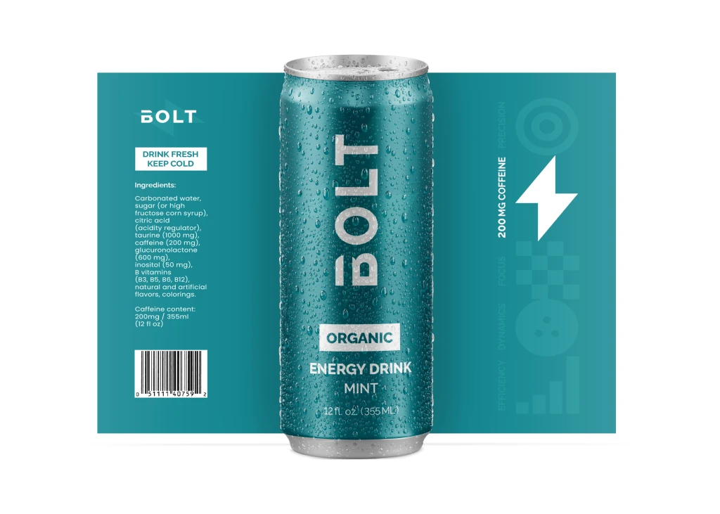
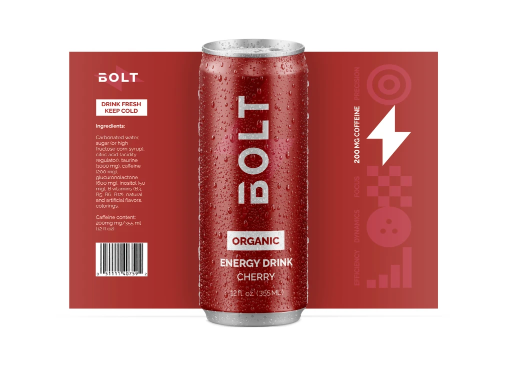
Each flavor of the BOLT Energy Drink is uniquely represented through a refined and cohesive packaging design:
Mint Flavor: The teal-colored can conveys freshness and revitalization, reflecting the cooling sensation of mint. The muted tone adds a sophisticated edge, appealing to an audience that values natural and organic ingredients.
Cherry Flavor: With a deep red hue, the cherry-flavored can evokes passion and intensity, mirroring the bold and tangy profile of the drink. This design balances vibrancy and elegance, ensuring strong shelf visibility.
Pineapple Flavor: A warm golden-yellow can radiates tropical energy and positivity, encapsulating the sunny and uplifting nature of pineapple. The subtle yet luxurious tone suggests a premium, high-quality product.
Let's get to know each other.
Let's get to know each other.
Let's get to know each other.